Dipsy Doodle: What "Globalization" Has Wrought
Why the rise of right-wing populism in America and Europe?

by Branko Milanovic, lead economist of the World Bank’s research department,
via Derek Thompson in The Atlantic
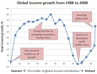
This graph requires some explanation. You've got, first of all, to resist the impulse to see the x-axis (horizontal) as a time line. This chart is a snapshot of the result after twenty years.
As Derek Thompson describes it: "Imagine you lined up every human being in the world by income, divided them into 100 groups ("percentiles") ranging from lowest to highest, and asked: How has the last generation of economic growth been for you?"
This is a graph of real income growth over twenty years for each income percentile of the entire world's population. The x-axis (horizontal) is not a progression over time. You'll get confused if you read it that way. It is just represents the different income percentiles or the world's population. The y-axis (vertical) represents the final result, the net total growth in real income for each percentile over the twenty-years.* So the third dot on the line indicates that the people in the bottom 15% of the world's population saw their inflation-adjusted incomes grow about 57%. From the bottom 15% to about 50% of the world's population saw significant (up to 80%) income growth. These would be the populations of the developing countries, especially the BRICs.
From about the 80th percentile (the top 20% of the world's incomes) to the 86th percentile (the top 14%) there has been a net decline in real income. Then you see another sharp (60%) increase for the top one percent, and especially the highest tiers therein, of the world's incomes. (That's about $130,000, which would be the income of the top 11-12% U.S. households.)
So a lot of people in developing countries, who have obtained new jobs and incomes in the world capitalist economy -- by some combination of the export of the developed world's capital, the increase of investment by indigenous elites, and the entrance into the capitalist wage economy of the ex- and putatively-still-"communist" states - have seen their incomes increase by the World Bank's calculations. That does not, it's important to remember, mean they are living high on the hog, just that their newly-acquired sweatshop wages put significantly more money than zero in their pockets.
The big losers, on the other hand, are the sectors of the world's population that had decent incomes, a few notches above average -- the kind of income that allowed for homes and vacations, but not limousines and villas. It's not hard to figure who they are; they're the people on the streets in Athens, Madrid, and Paris, in the state capitol in Wisconsin, and those losing their pensions in Detroit.
Of course, there’s absolutely nothing wrong with the people in developing nations earning more income. And there’s absolutely no reason that decently-paid workers in developing countries could not have real income gains as well. The diabolical inverse relation between these two sectors of the world’s population that this graph presents is not a necessary result of “purely” economic factors, but of the political economy of world capitalism. In that political economy, growth in profitability for the top 1% is always the main objective, and is always supported by various (and variable) supporting structures of inequality among the rest of the population.**
As Joe Wiesenthal puts it, at Business Insider:
In the chart you can see how lower income percentiles have seen monster growth since the late '80s. This growth represents the emerging economies and the rise of the Chinese middle class. Then you have the developed world middle class, which has seen almost no real income growth over the last few decades (which probably explains a lot of the current angst over inequality). And then you have the rise of the ultra-elite, the global 1%, which has done fantastically well during all this time.
Thus, this graph partly answers the question: Why the rise of right-wing populism in America and Europe?
The other part of the answer to that question is contained in the sad vacuum at the end of this one: Who, in the "liberal" sectors of the political and media establishments of the "developed world," actually speaks and works for the "lower middle classes" in their own countries?
[Modified on 1/28/2014 to explain chart more fully.]
[*Added words "the final result" to this sentence on 2/1/2014.]
[**Added this paragraph on 2/1/2014.]


