Pictures of the World
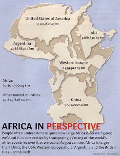
Yesterday, I posted this map on the Polemicist Facebook page:

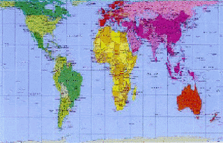
After seeing some of the responses, I realized that many people may never have seen, and are not aware of, the famous Peters Projection Map, and the issues it addresses:

To summarize the issue: As pointed out on the Peters Map site, any flat map has a problem "projecting" a three-dimensional globe on a two-dimensional surface, and any such map will introduce some distortion. No map will show both the size and shape of geographical formations accurately. The map with which we are all familiar, the Mercator projection map, which was designed around 1659, was not designed to depict relative sizes of continents and countries accurately, but to show the shapes of continents fairly well. The Peters Map, first presented by Dr. Peter Arno in Germany in 1974 (and first published in an English-version in 1983), is an equal area map that shows all countries, continents or oceans according to their actual size, and makes accurate comparisons possible.

